I’ve used Saal a few times to produce photo books for myself, and as gifts for others, and while I had mostly positive impressions about my first book, there were some misgivings.
By way of disclosure, I was offered a voucher towards the cost of the book, but that in no way colours my impressions of the process and impressions of the finished book.
The Software Side
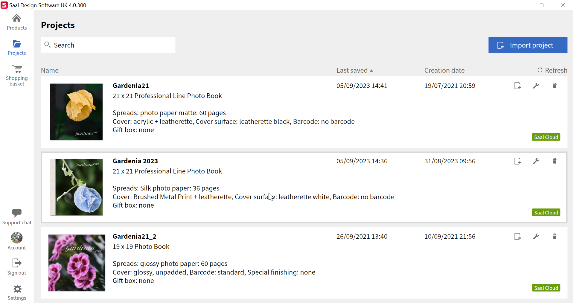
The application Saal uses is pretty much the same as it’s always been. I like that you can save projects to their cloud which makes for a very simple re-purchase option. It’s still a little frustrating that each project is specific to the product you’re buying, so if you want to change it to a different size, you need to start from scratch, so it takes some planning before you start.
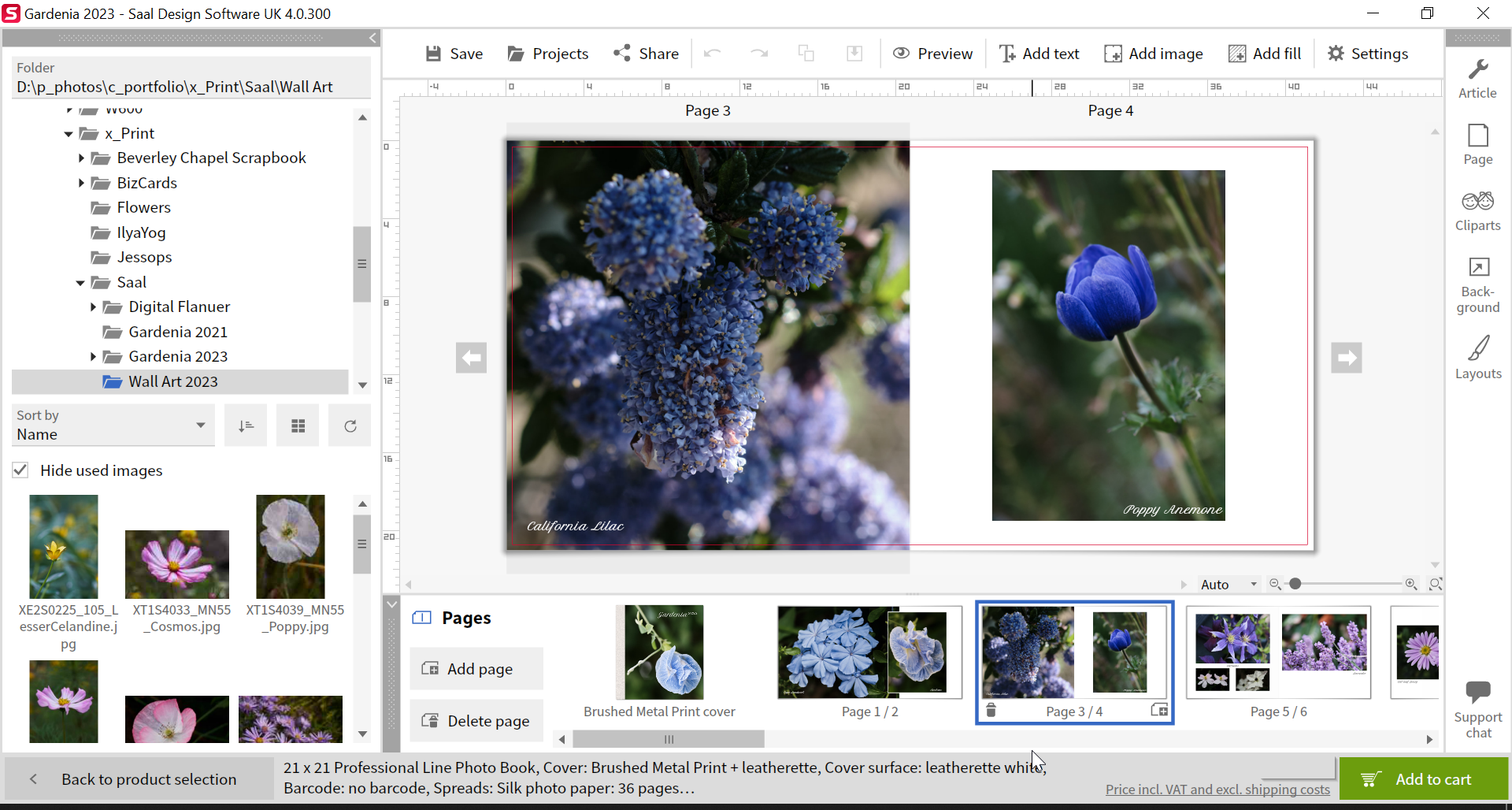
I’ve grown used to the way the application works and find it quite intuitive. There are templates and icons and frames, or you can go free-style and drop images and text where-ever you want. I must admit, I’m averse to using templates so the freestyle approach works really well. Aligning objects with other objects works well and you can layer objects too. It’s all basic functionality you would find in most photo book applications, but it’s all there in the Saal design software.
The Order Process
Once the book is completed, you can order the book directly from within the application. There are a lot of finishing options to choose from and sometimes it can be a bit bewildering, but there are brief descriptions of each option, so it’s not a total guessing game.
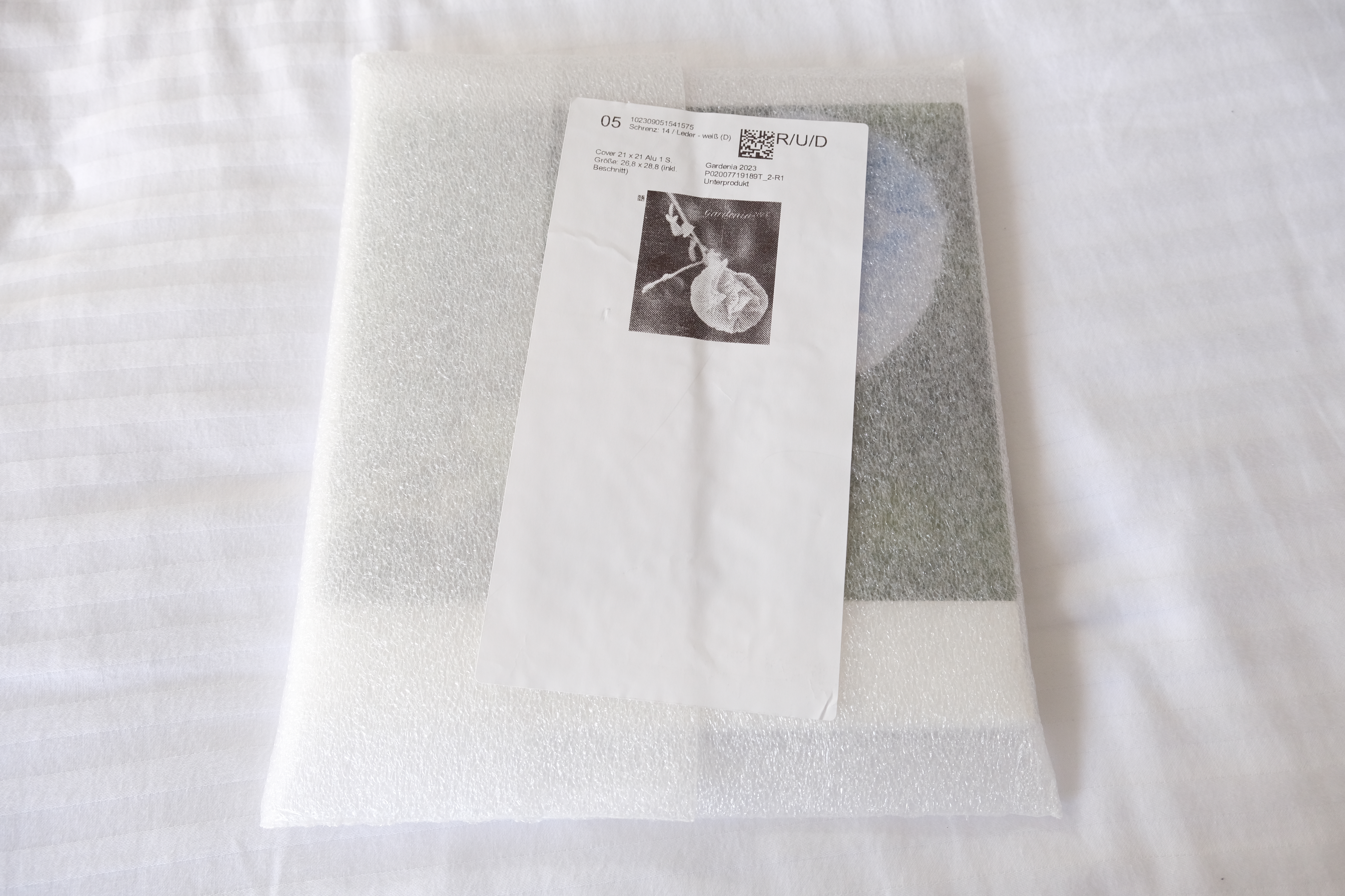
The book arrived within a week, which is not bad at all, and it came well protected in a plasticy bubbly sleeve type thing.
The Book Itself
So let’s get the negative out of the way first.
I opted for a brushed metal cover (Previously I’ve gone for the acrylic cover which is really nice) with silk finish papers (Previously I’ve opted for matt and gloss).
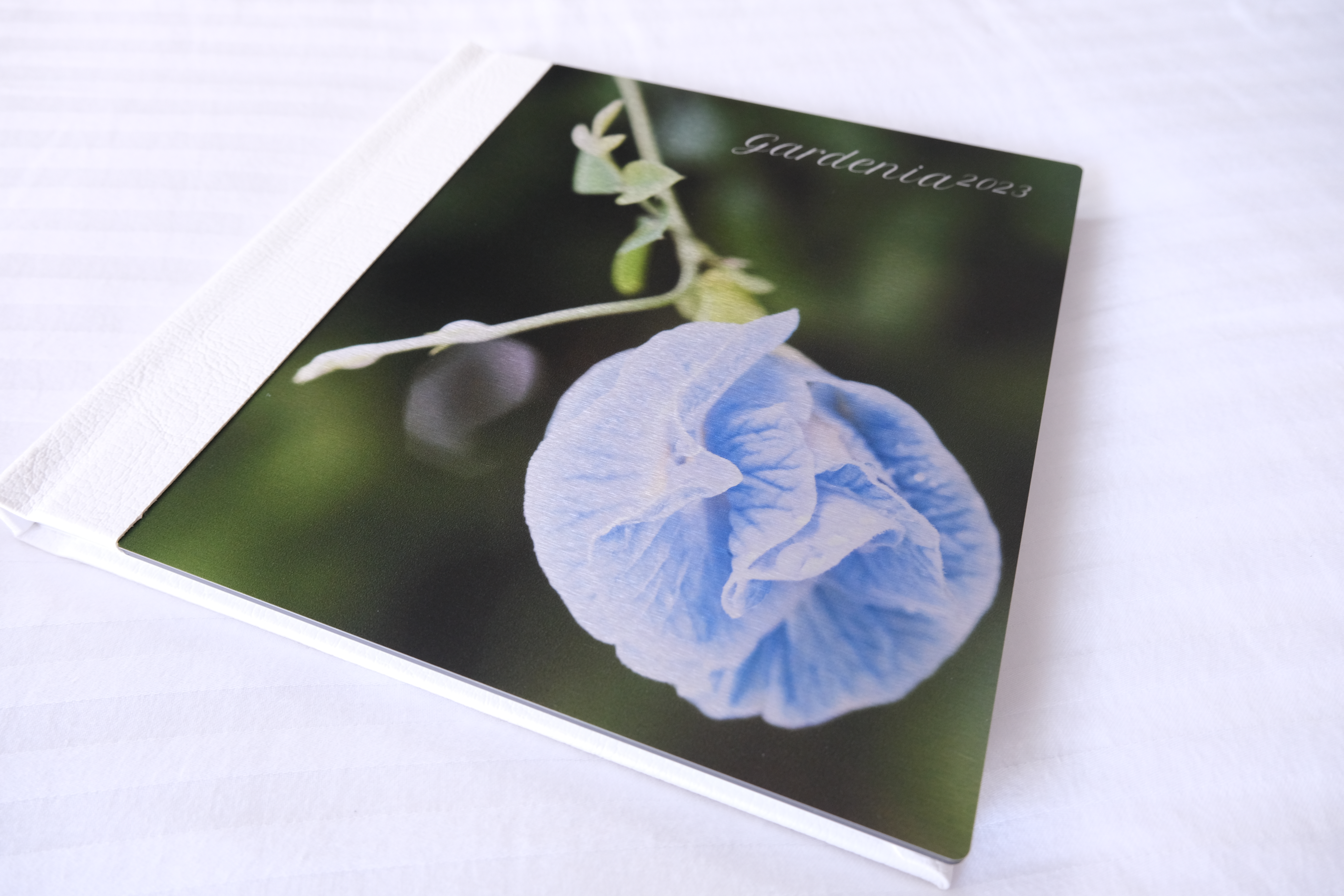
The cover was a little disappointing. The brushed metal is a nice effect, but the flower is quite light and a lot of the detail has been lost and looks washed out. I think a darker or more contrasty image would have worked better.
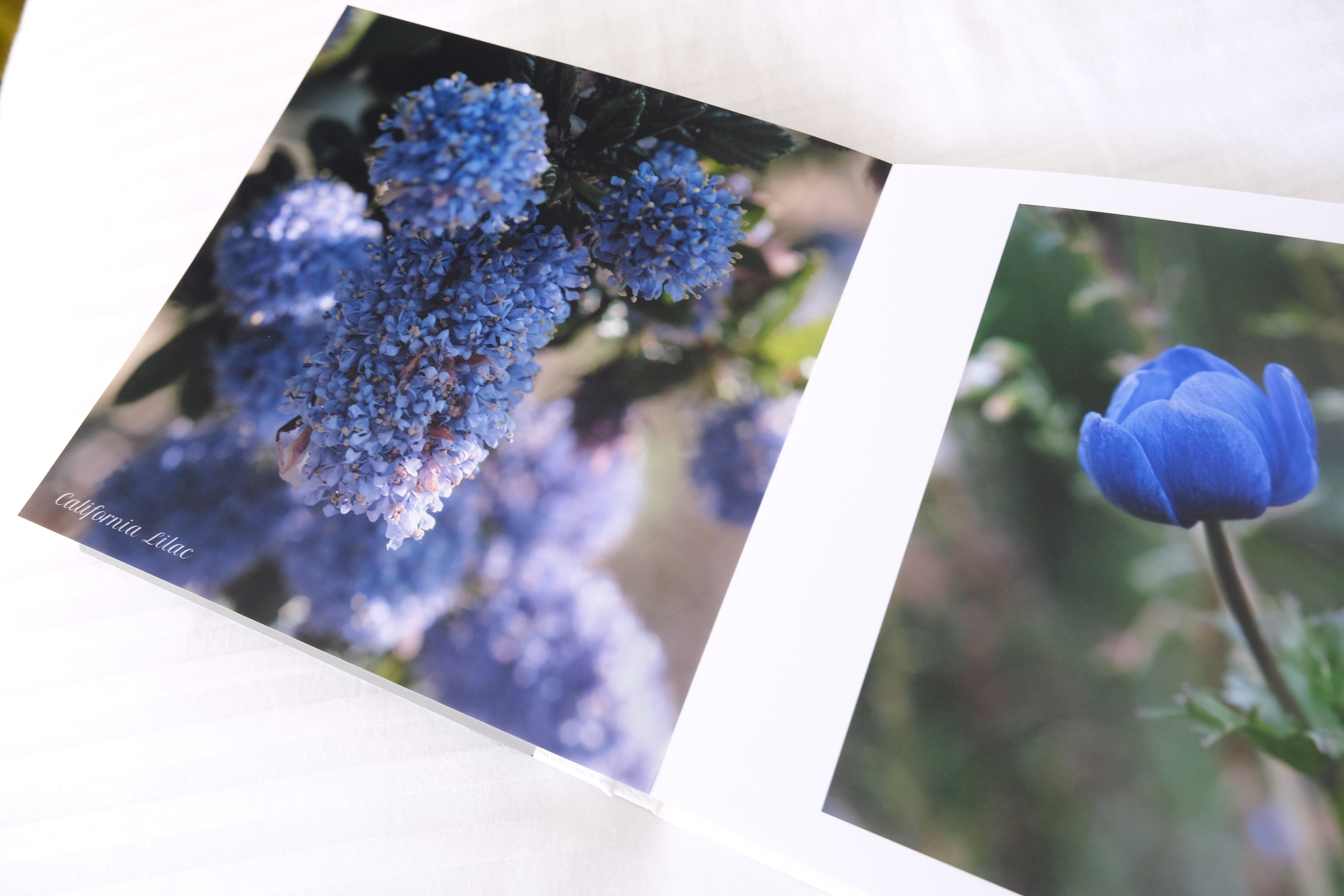
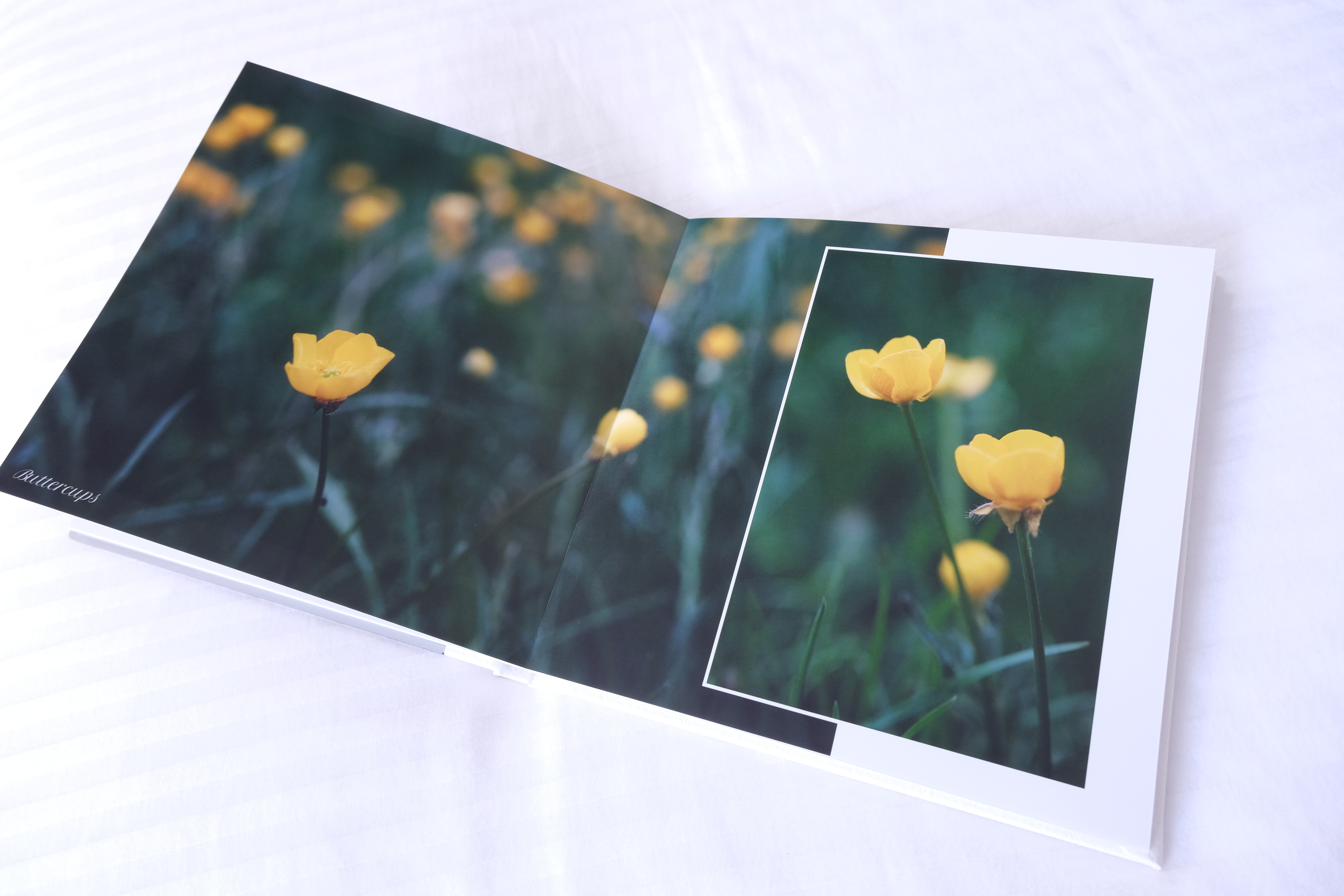
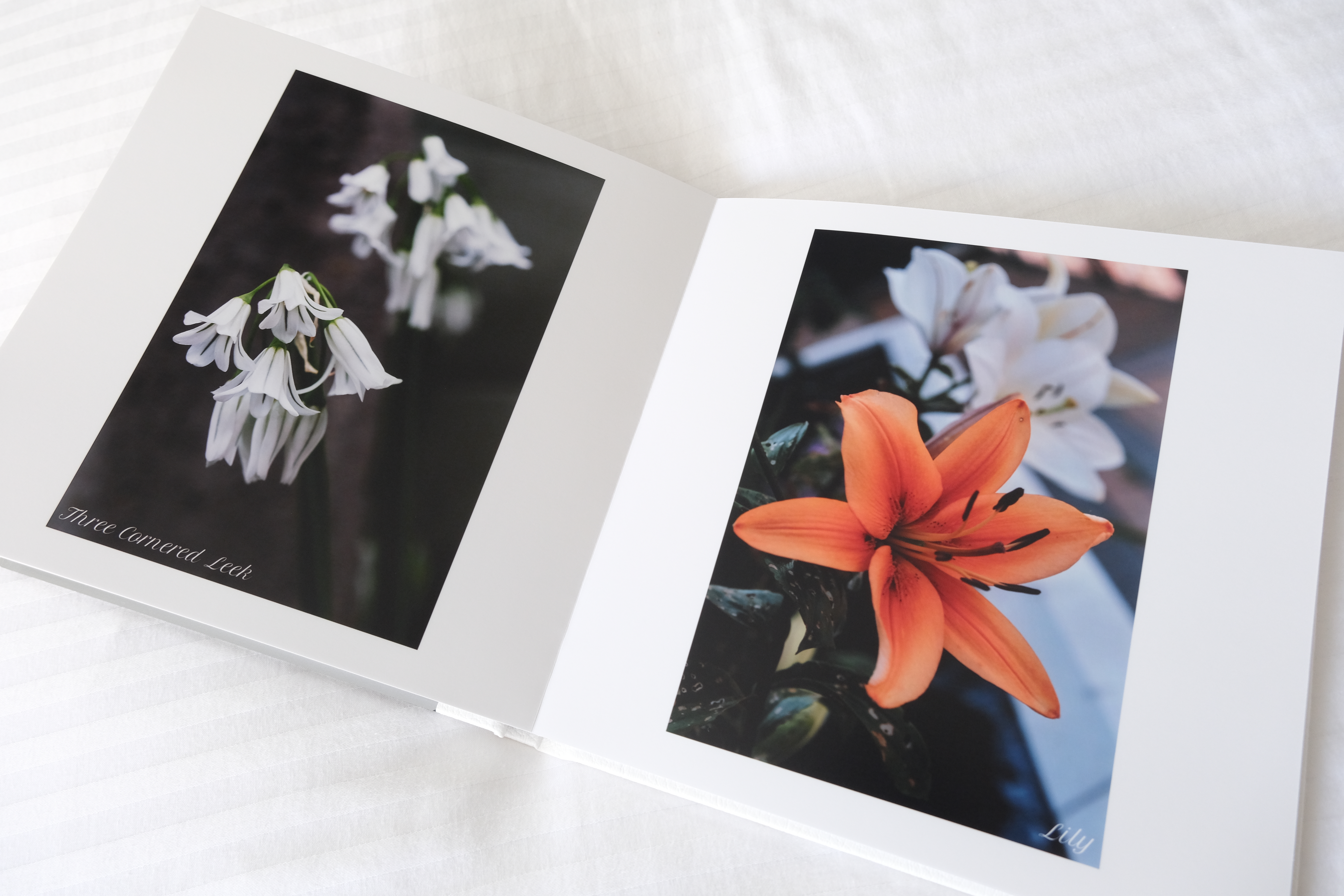
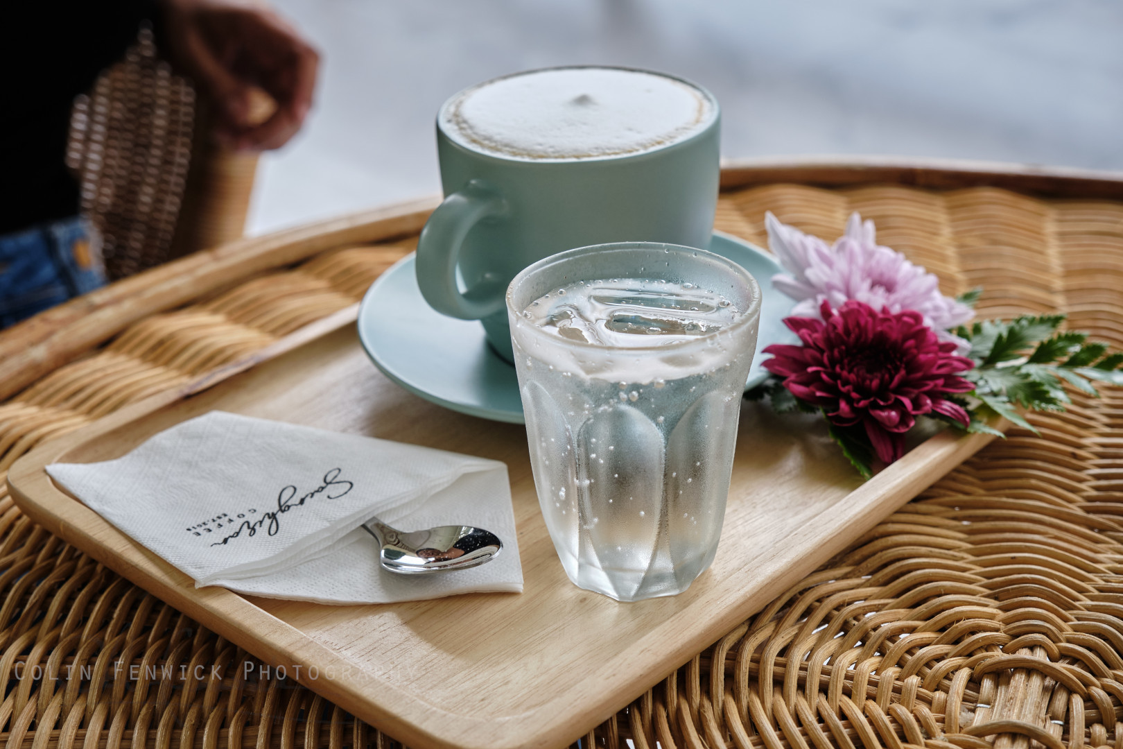
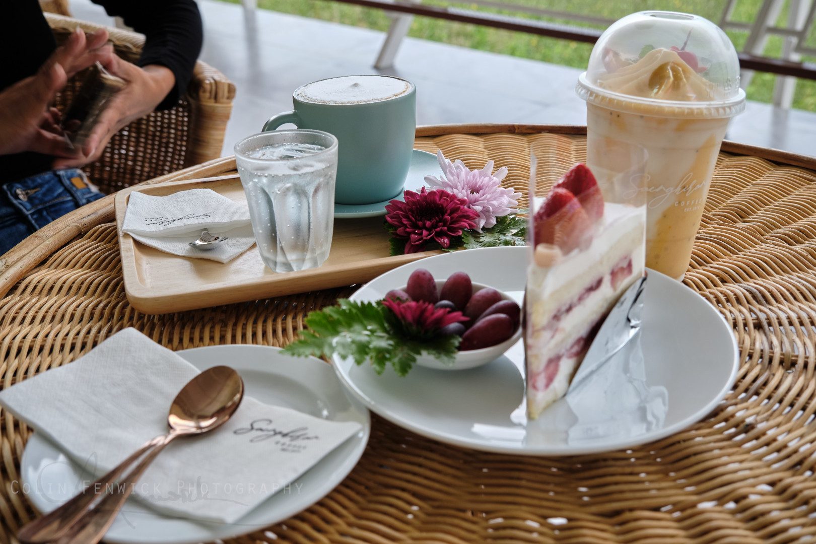
Now onto the positive. The silk pages have a honeycombed plastic type covering which I actually love. It’s very different, but the images just pop. The images are sharp and crisp. The colours are accurate. The images really do look spectacular. I can’t say enough wonderful things about them. If anything it made me wish I had better images to place in the book. They look so much better than they do on the screen. I smiled turning over each page and seeing the images gain a vivid new life. (As you might guess, I was impressed :))
And that’s kind of the point, isn’t it?
Online albums on your phone/tablet, or online are great, but in this age of e-this and i-that, there is something just that little bit extra special about seeing your photos in print – something analogue you can actually hold. Photographs should be printed and hung on walls or placed in the pages of photo books, but they need a good printer and Saal really did a grand job printing these.
Saal (www.saal-digital.co.uk for the UK) always seem to have offers on a variety of their products, so it’s worth keeping an eye on their website. Definitely worth considering.